When BI4 came out back in 2011, one of the tools that saw an overhaul from the ground up was Web Intelligence. If you are not familiar with Web Intelligence, it truly is the ‘jack of all trades’ or ‘swiss army knife’ of the suite. And if you are familiar with the tool then you are also aware of its limited charting capabilities in XI 3.1 and earlier versions.
Today with BI4, the charts inside Web Intelligence are catching up with those of Dashboards (Formerly Xcelsius) as well as other non-SAP dashboard tools. In fact, on a mobile device you would be hard pressed to distinguish between a Web Intelligence report and a Dashboard.
With report design done for mobility first, more charts and graphs are finding their way inside a report with fewer tables and crosstabs. And of course, new paths lead to new problems and hopefully, new solutions.
One issue I encountered recently with a report was resolved using the rank function in Web Intelligence, even though the function I was really looking for was a Sort. This example can be used to show the sort as an unbounded rank.
Let’s take a look at the following table below:
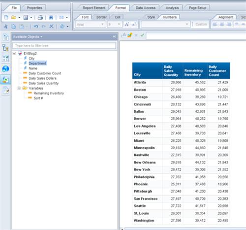
Not exactly the flashiest table inside of the Launchpad and probably even clunkier looking inside of an iPad. It’s just a simple table with cities broken out by Inventory, # of Products sold, and # of Customers.
Let’s say we wanted to view this table as a stacked bar chart instead of a table to get a more visually perspective with the dataset.
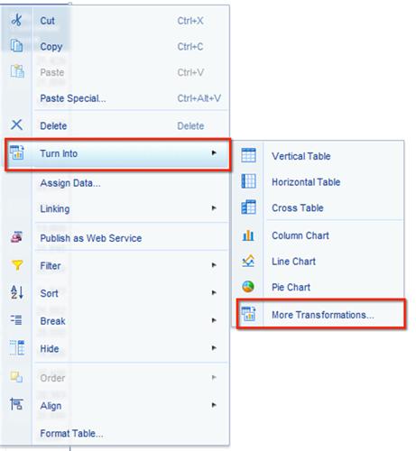
We right-click on the table, select turn into, if we don’t want to use one of the three main visualizations, we can instead select more transformations and see what else we have at our disposal.
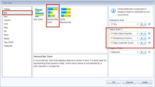
Bar charts are good for visualizations, so we end up with the following Stacked Bar Chart below.

Now comes the point where you imagine your end user coming back to you and asking you to sort descending based on the total of the three measures combined. At this point, can you clearly tell which city has the highest combined value of the three measures and which one has the lowest? If you can’t tell within 2 seconds then you’ve lost your audience and have posed more questions than answers.
So, we create a custom measure within the report called sort # and make it equal to =Daily Sales Quantity + Remaining Inventory + Daily Customer Count. However, when we go and look to sort by this custom measure, it is nowhere to be found.
We can only sort based on the City Name or the three measures included in the chart. We could add the custom measure to the actual chart and then sort by it but it would defeat the purpose of keeping the chart with just the three main measures. Additionally, we don’t have the ability to hide the measure inside of the report like we do with a dimension inside of a table.
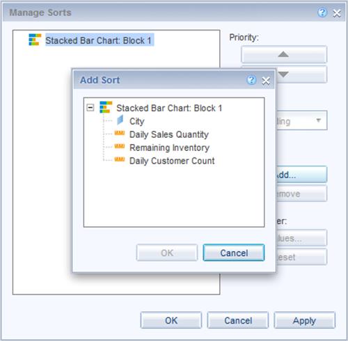
A possible solution would be to look at the rank function instead. Click on your chart and go to the Rank button under the ‘Analysis’ tab. We do see we have access to rank on the ‘Sort #’ custom measure along with the other three universe measures.
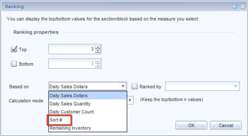
However, instead of selecting the top 3 based on Sort #, let’s make that number an incredibly huge one that we will never reach, say 10,000,000,000 and change the Top selection to a Bottom selection instead. Then press ‘OK’ and see how the chart behaves.
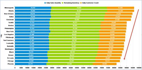
Looks more visually appealing and the rank played the role of a sort without having to make any changes on the universe end. Now we can easily identify Minneapolis as the city with the highest based value of the combined measures and Phoenix as the lowest. Anytime you incorporate a workaround, always check to make sure your #’s are consistent and haven’t been compromised as a result.
Have you come across similar issues in the past with sorts and charts? Please share your thoughts below.